COUNTRY CANINE DIRECT MAIL AD
Graphic Design
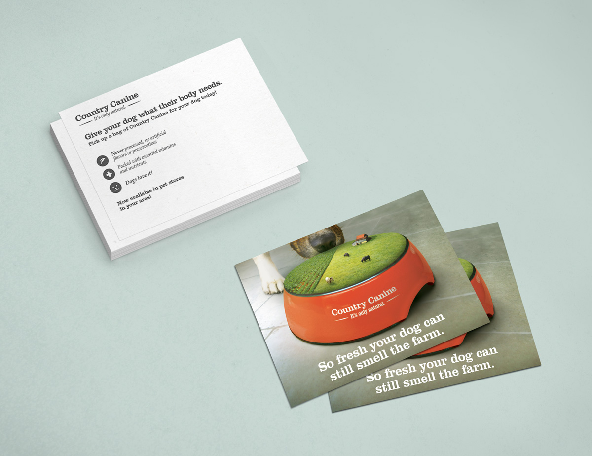
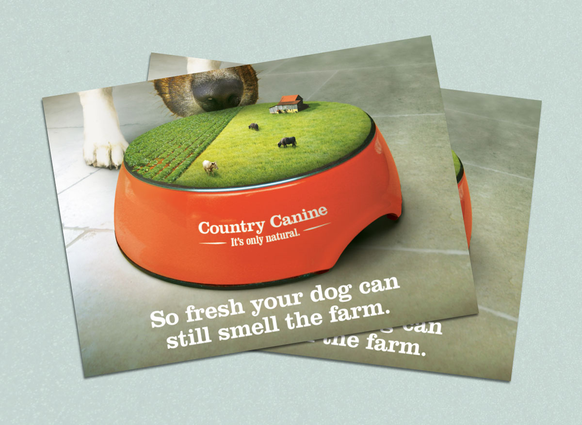
I was challenged to create a concept for a brand of dog food, and then come up with an advertisement for a direct mail campaign for this brand. Positioning my brand of dog food as a very natural, additive free food, I created a friendly country brand persona and named it "Country Canine". I wanted the advertisement to communicate the brand as quickly and impactfully as possible, so I put my focus into communicating mainly through a visual metaphor with minimal written copy. With the farm/bowl visual, I aimed to communicate the idea of farm freshness and unprocessed rawness. Because direct mail ads are only seen briefly before being thrown away, the ad is designed to be understood immediately in order to get the message across to the viewer within that short time frame. The photo manipulation was created from several different images, which were each edited enough to create a seamless, professional, and believably realistic image. After all images were edited and put in place, I increased the overall amount of green in the image to create a warmer, less sterile feeling than its previously cold, bluish tint. The typeface used for the brand was chosen for its thick, rounded, friendly feeling, which aided in creating a down home, country personality for the brand.

