EMPIRE STATE VAPOR
Branding
Empire State Vapor is a brand of luxury e-cigarette liquid flavors based in New York City. I was commissioned to conceptualize and design their brand identity, packaging, and website. The project was such a success that in the startup's first week alone, they sold over 116 bottles and received a bulk wholesale order to have their product sold in other e-cigarette stores.
When the project began, the company's owners explained to me they wanted a classy, metropolitan, Art Deco-esque look for their brand, but didn't have much of a strong concept together past that. I helped them to focus their creative energies by boiling down their brand position to the idea of being "the fine wine of e-juices." Empire State Vapor's manufacturing process includes aging the e-juices in Kentucky oak bourbon barrels, an interesting and unique fact that they had been underplaying in their concept until this point. I proposed using this distinctive process as a part of their marketing handle, building off the comparison to how fine wines are made, an idea the stakeholders loved. When the time came to transfer their position into a coherent visual identity, I made heavy use of this memorable handle with the intent of creating a visual and conceptual niche in a market ubiquitously filled with busy, grungy, unfocused, and unprofessional design.
Rather than just idly depicting New York with literal symbolism, I decided to reinforce the "aged in oak" handle in the oak leaf logo and visual motifs. The look of the logo is meant to inspire a comparison between smoking an e-liquid and drinking a high end wine in an upscale restaurant in uptown Manhattan. To achieve this, the logo draws influences from wine labels and New York Art Deco motifs, making use of rich patterns, tasteful minimalism, evocative typography, and a proud, well spoken brand voice.
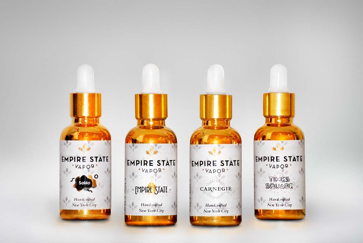
After establishing the brand identity, we moved onto designing the packaging. The four flavors, Empire State, Carnegie, SoHo, and Times Square, were concocted to emulate the feelings one gets when visiting each iconic New York City landmark. The flavor labels, too, had to be designed to create matching impressions. This stage was challenging, as it required a significant amount of content to be fit onto a very small, 3in x 1.75in label. The labels were then placed on 30ml gold electroplated bottles, allowing them to stand out clearly on shelves of flavors.
Their website can be found at empirestatevapor.com, however much of the original copy has been changed by the owner since going live.


