FHIA
Brand Identity
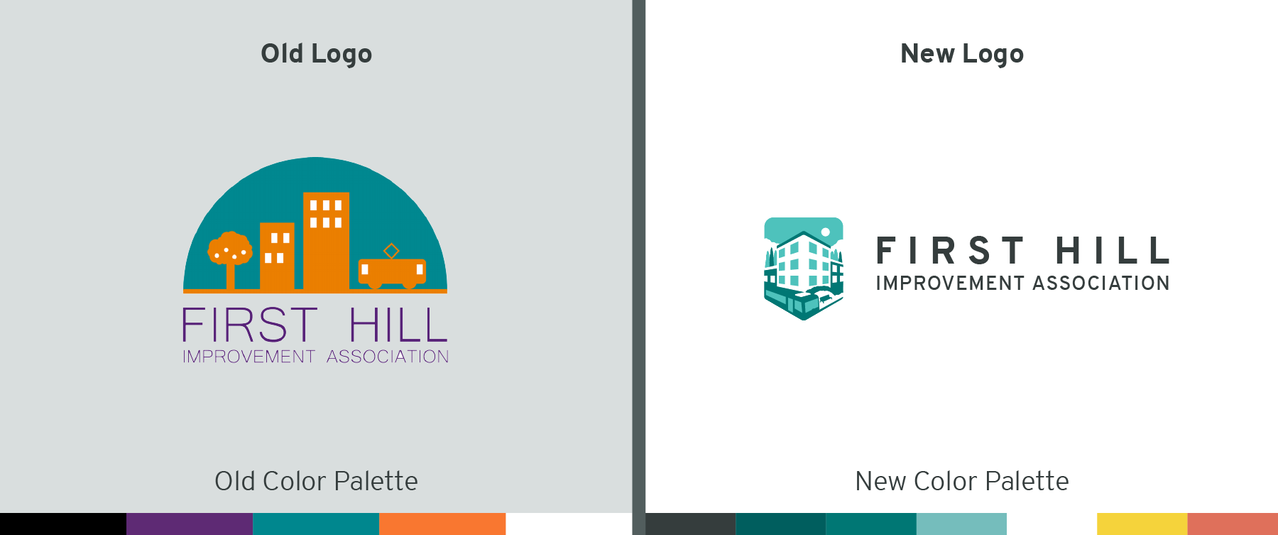
The First Hill Improvement Association (FHIA) is a government funded non-profit organization located in the First Hill area of Seattle that is dedicated to improving First Hill through community-driven and community-oriented public works projects. Through my work with them on the signal box public art series and the I-5 column public art I earned a close relationship with FHIA, and having seen both my artistic work and conventional design work plus my clear knowledge and connection with the area, FHIA thought I would be the perfect designer to hire to refresh their brand. The new brand retains elements of the old logo (buildings, greenery, the First Hill Streetcar), but converges them into a sleek softened shield shape to convey feelings of protection and care as a reflection of their service to First Hill. The typography was chosen to imitate street signs, as well as the typography on the sides of the signal boxes I designed. The color palette was also refreshed by taking the old seemingly random color scheme and replacing it with a scheme that is based around a similar blue-green key color, but with more harmonious tints, shades, and accent colors. Overall, this gives the First Hill Improvement Organization a friendly, calm, bright, happy, and energetic look.


