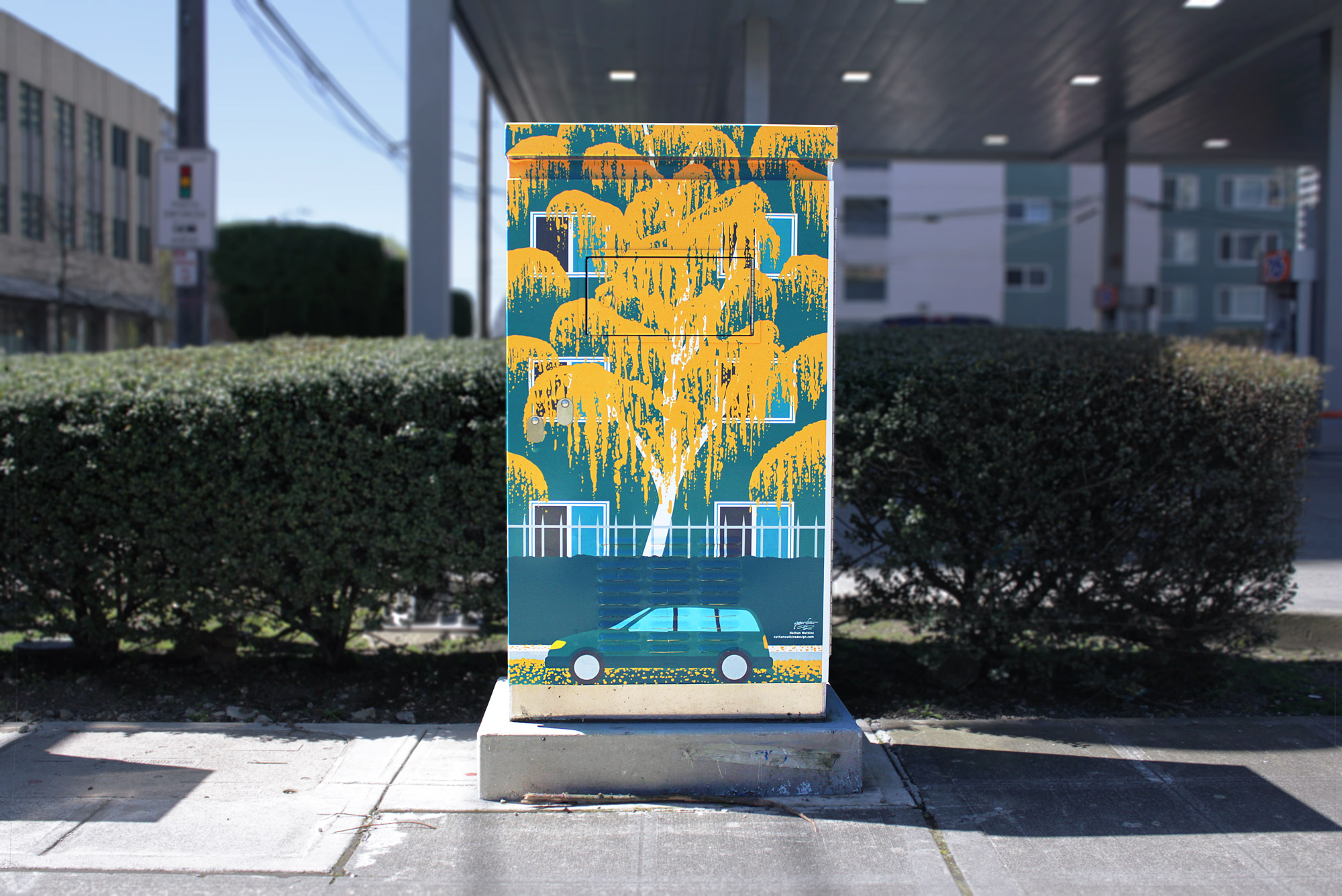
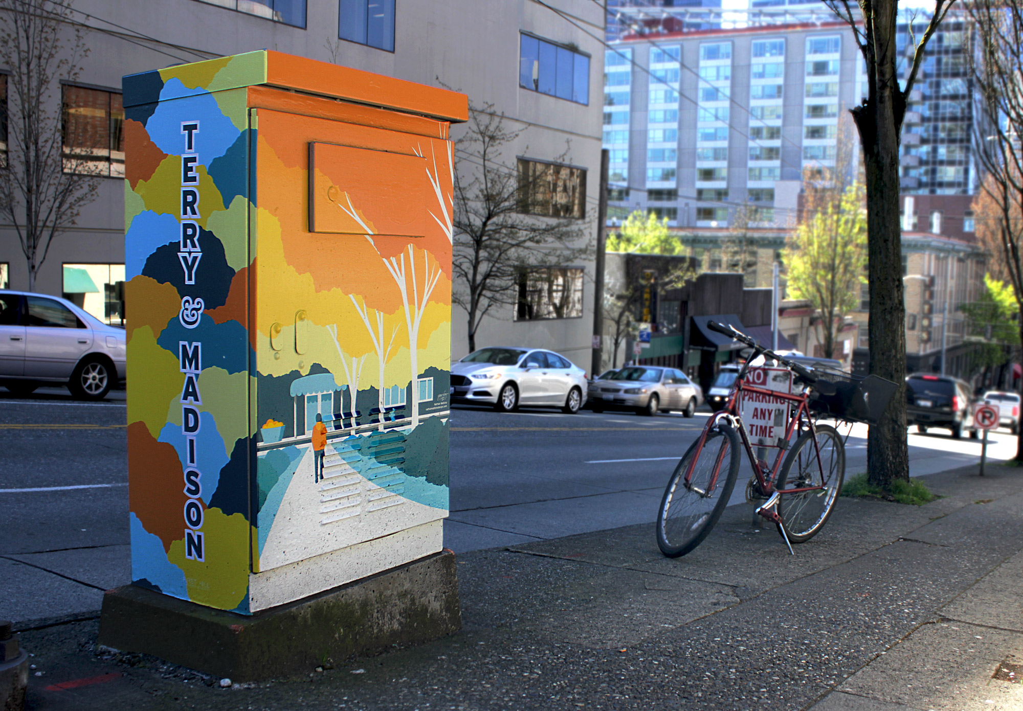
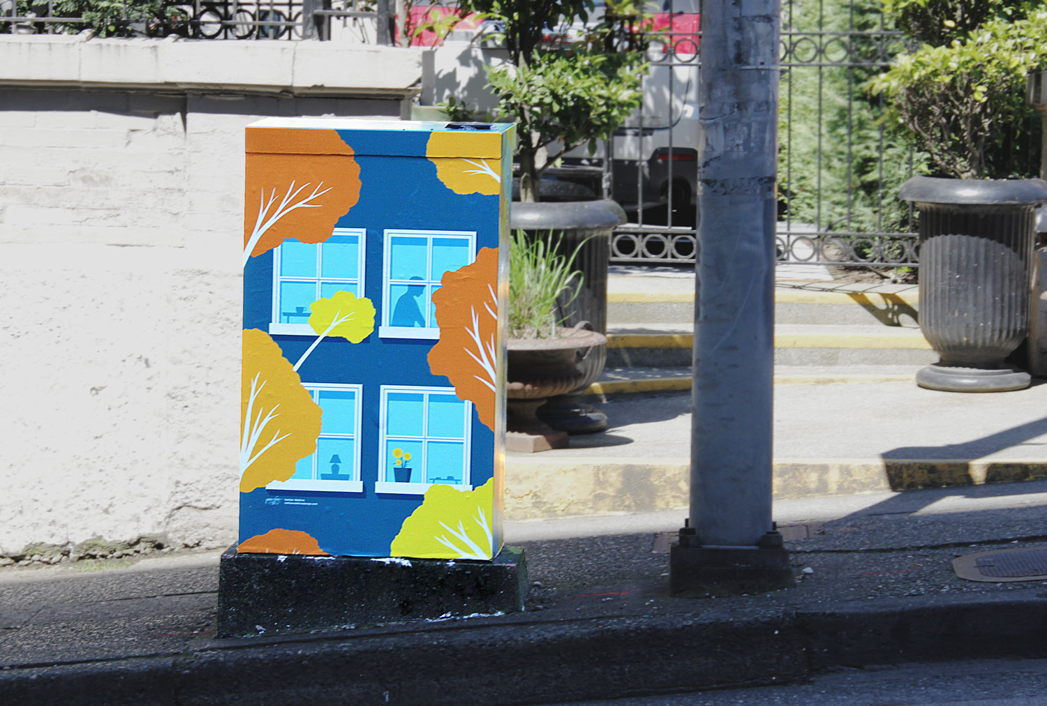
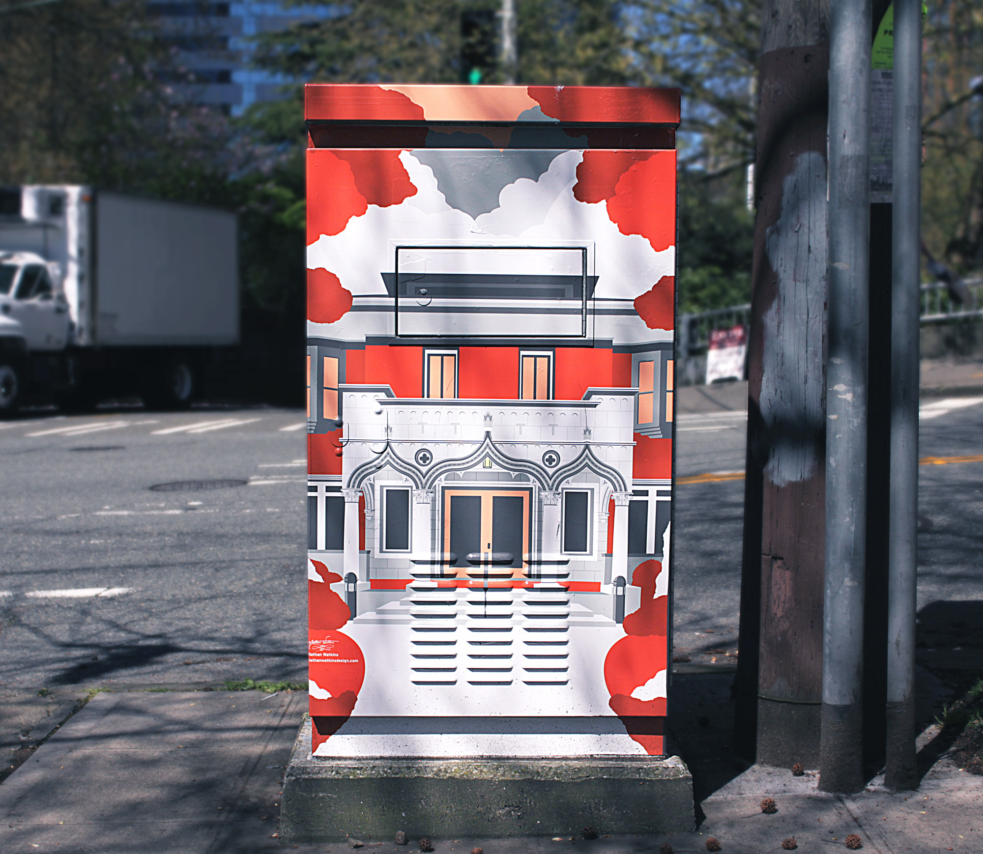
Redesigning First Hill's Signal Boxes (A 20-Piece Series Over 10 Boxes)
Public Art
Overview
After my illustration, "Beyond 12th & Jeff", was voted to both the front page and the all time highest voted posts of Reddit's r/Seattle and r/SeattleWA, it caught the attention of Seattle's First Hill Improvement Association (FHIA), a government-funded urban improvement organization who had coincidentally been searching for an artist to represent First Hill in a public art project that would adorn 10 signal boxes on 10 different street corners spread across the district. First Hill is the area in which I resided while attending Seattle University, so naturally I felt very prepared to represent the area I called "home". The district sits directly beside Seattle's main downtown area and the lively Capitol Hill district, so it would be seen by hundreds of drivers and pedestrians every day.
The Process
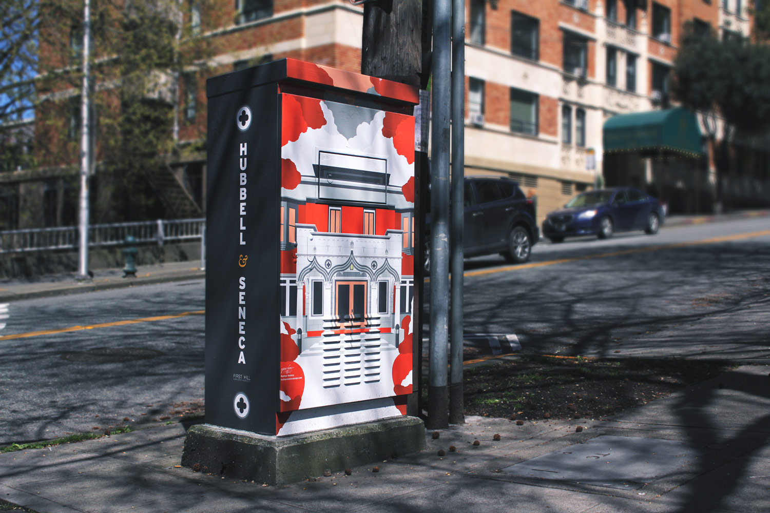
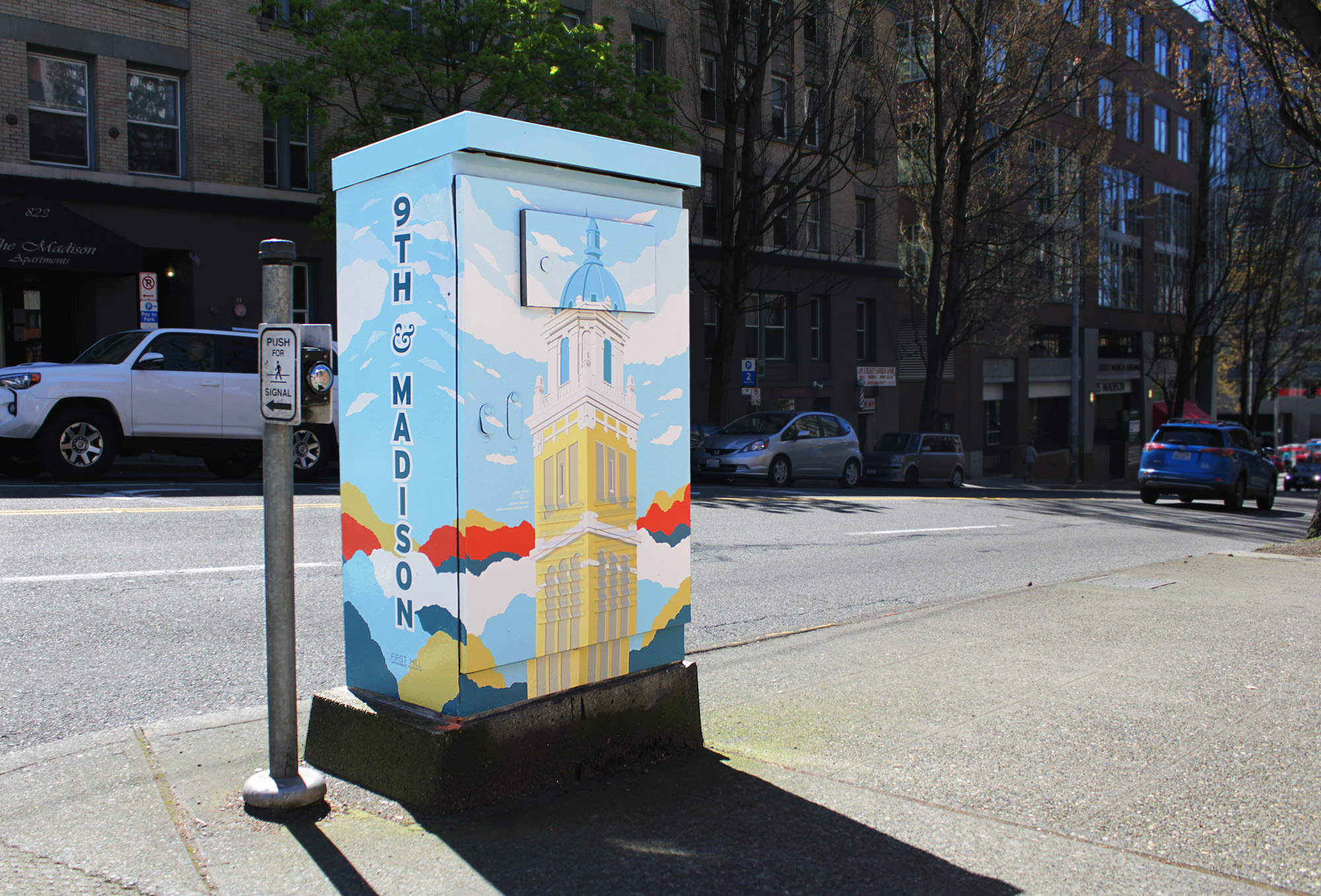
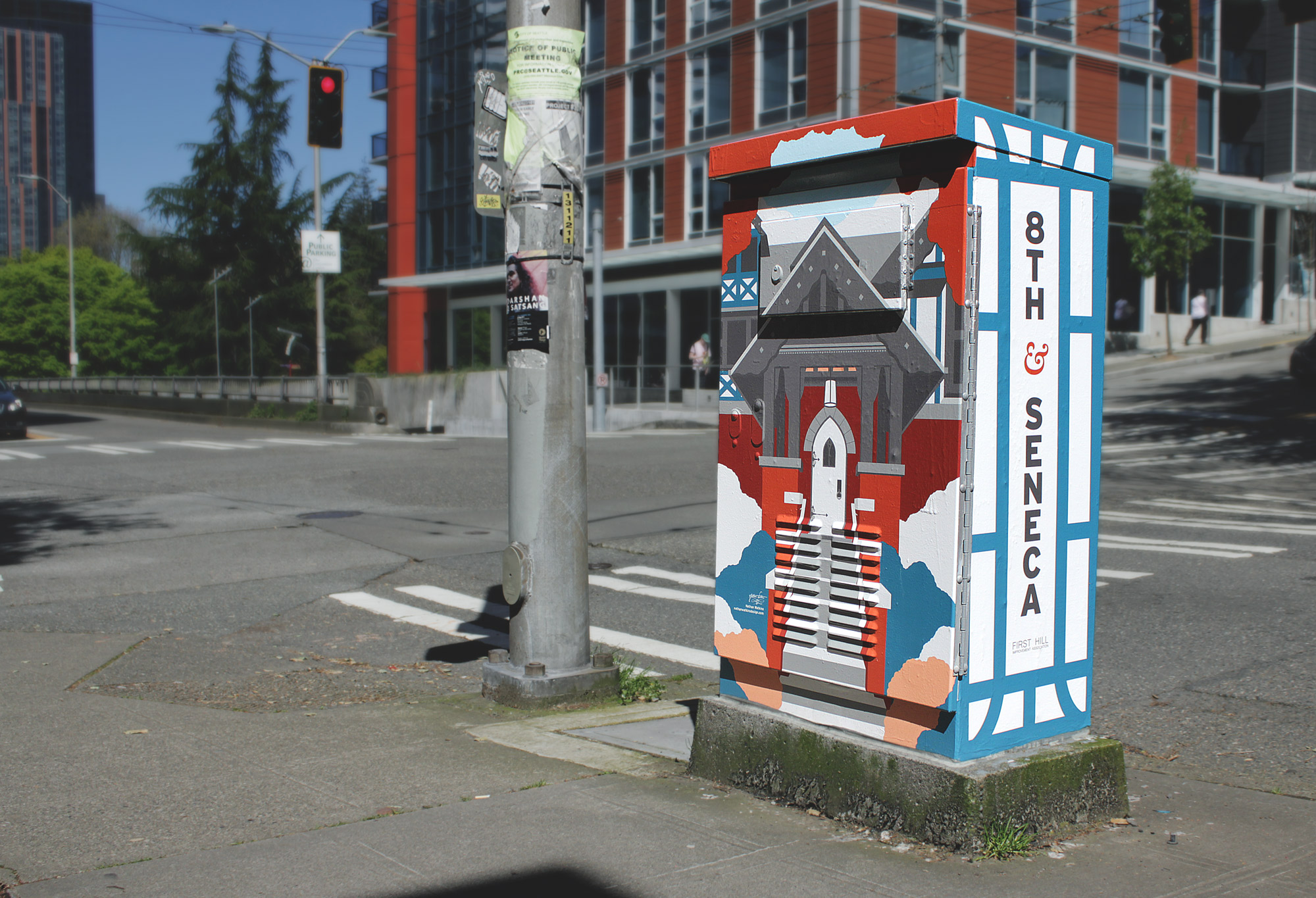
After quickly being hired on to tackle the project, I began contemplating what would be required from both a design and conceptual standpoint. With each of the 10 boxes having 5 sides, this meant 50 panels needed to be designed, and in a way that would allow for quick and accurate execution. With this in mind, I decided to create the pieces digitally and with a simplified, semi-abstracted style similar to the one used in "Beyond 12th & Jeff", which would allow for greater creative freedom, flexibility, and malleability. The side panels would need to feature the intersection names where the boxes stood, as per request of FHIA, and the top panels would rarely be seen, which meant that the 20 remaining largest panels could contain the main compositions. Conceptually, the 10 box series needed to effectively reflect the core "essence" of First Hill. To learn what exactly this essence was, I began the ideation process by exploring nearly every street in the First Hill district, spending hours at a time over multiple days just observing, soaking up the area, people watching, and reflecting on my own reactions and perceptions of my experience on the hill.
The Concept
Having discussed with FHIA director Alex Hudson what the association had in mind in terms of subject matter, we landed on the idea that it would be ideal to celebrate First Hill's landmarks and scenery first and foremost, as well as embody the character of the hill by drawing from my skills in branding. After an extensive research process, I was able to distill my conception of the essence of First Hill into just one word: "Sanctuary". This word would become both the title and driving theme behind the entirety of the series. I found that this word fit First Hill exceptionally well; as home to the largest concentration of hospitals in Seattle, a number of homeless shelters, architecturally impressive places of worship and healing, extraordinary urban greenery, and the highest population density in the city, First Hill seemed to naturally embody ideas of home, safety, and peace, especially when considering the fact that even though First Hill is nestled directly between the ever-bustling downtown area and the youthful, energetic Capitol Hill district, it is somehow always calm and quiet, with pedestrians never seeming to need to move faster than a pensive stroll.
The Artwork
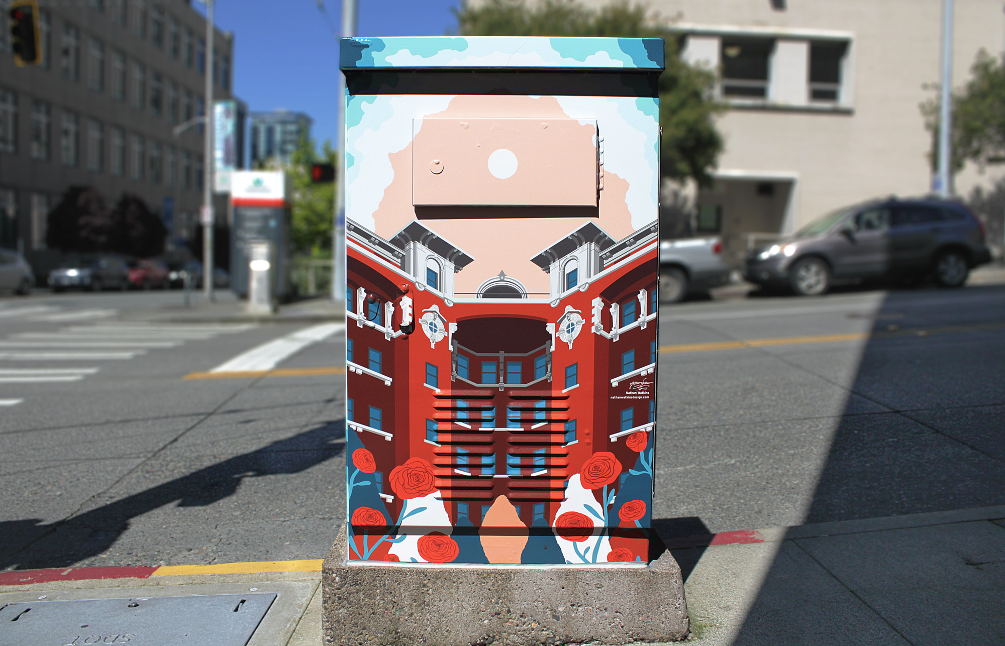
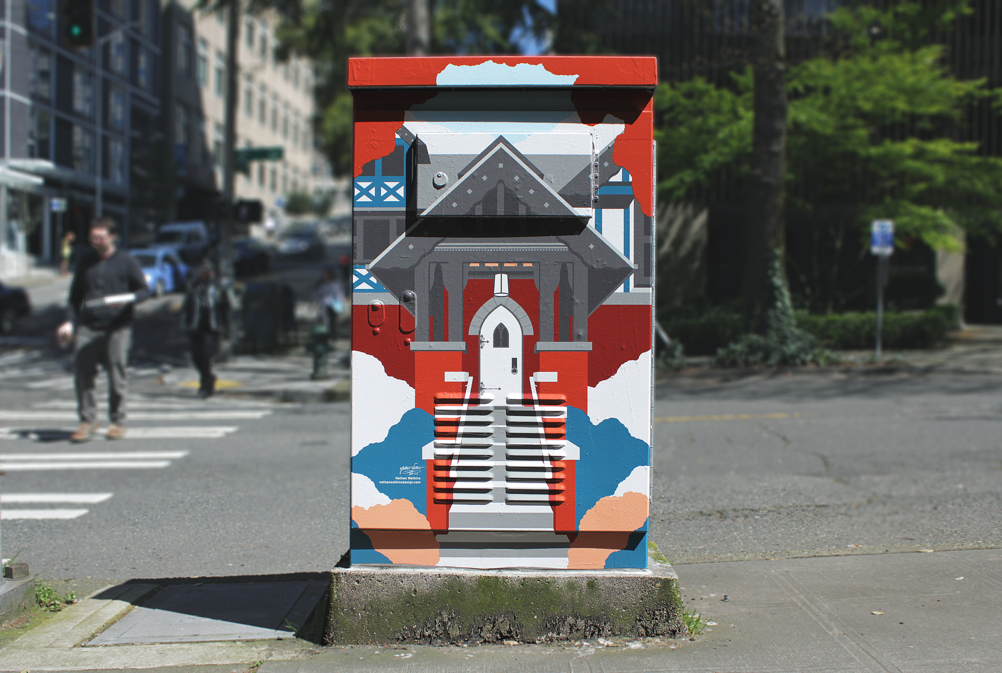
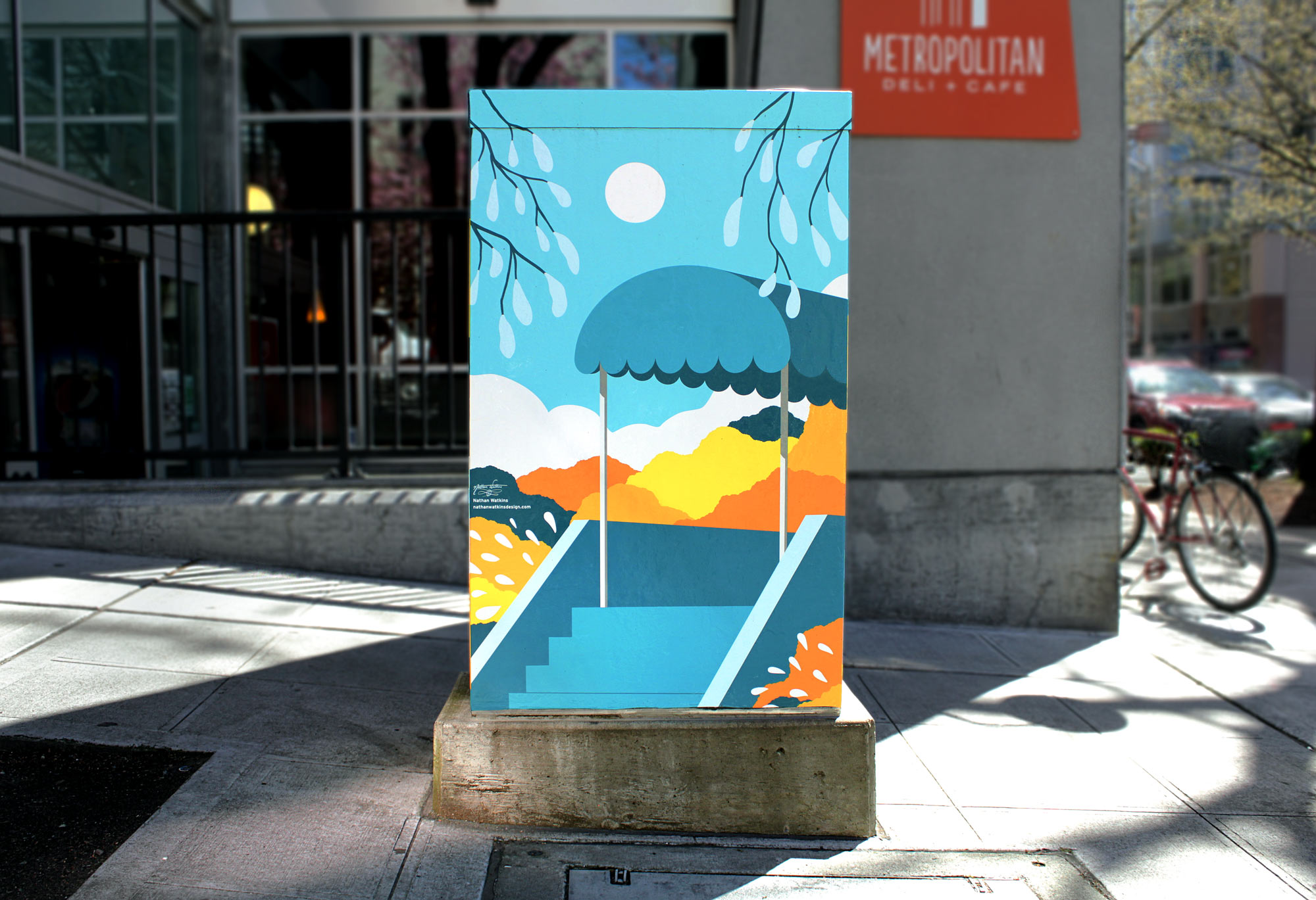
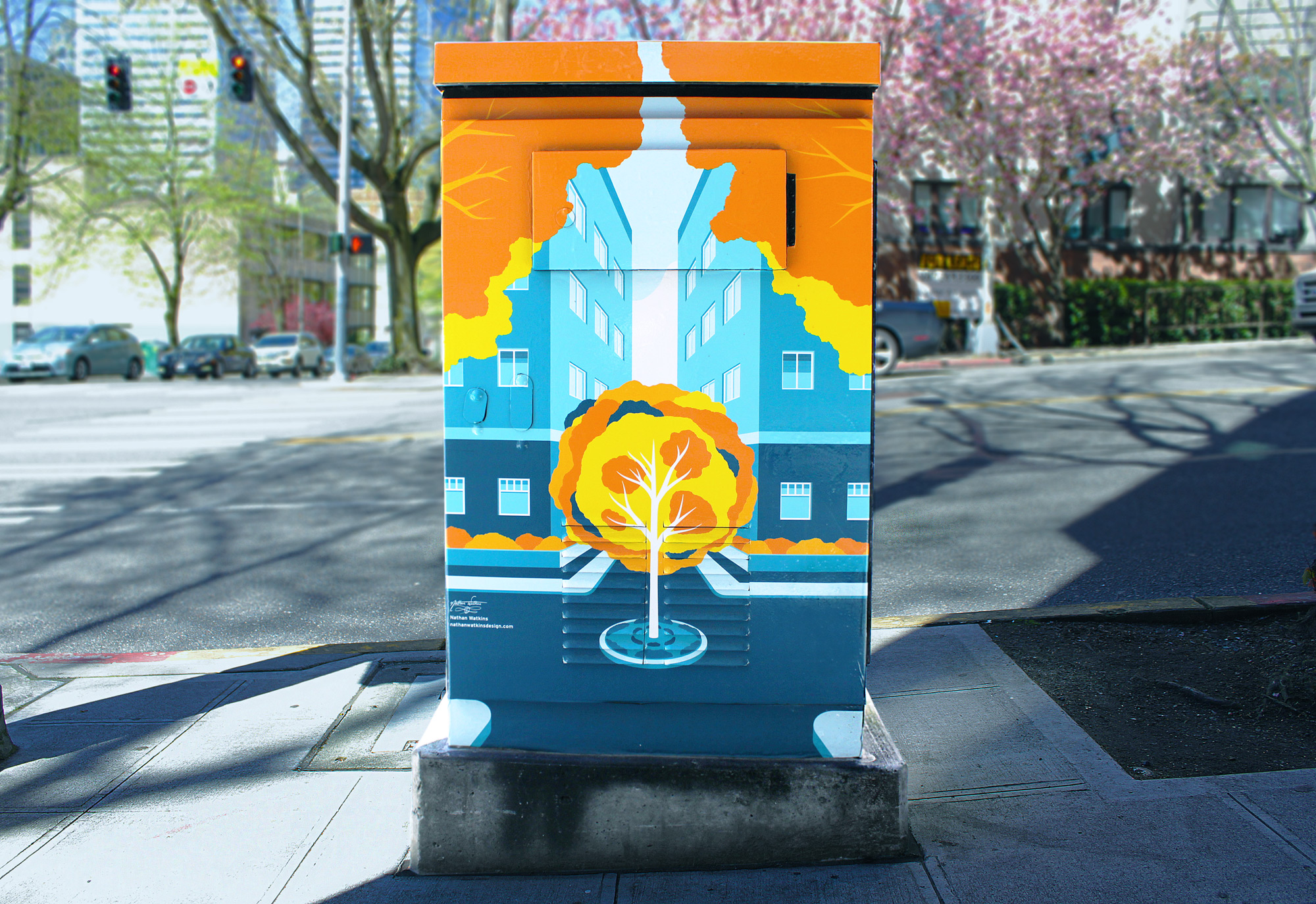
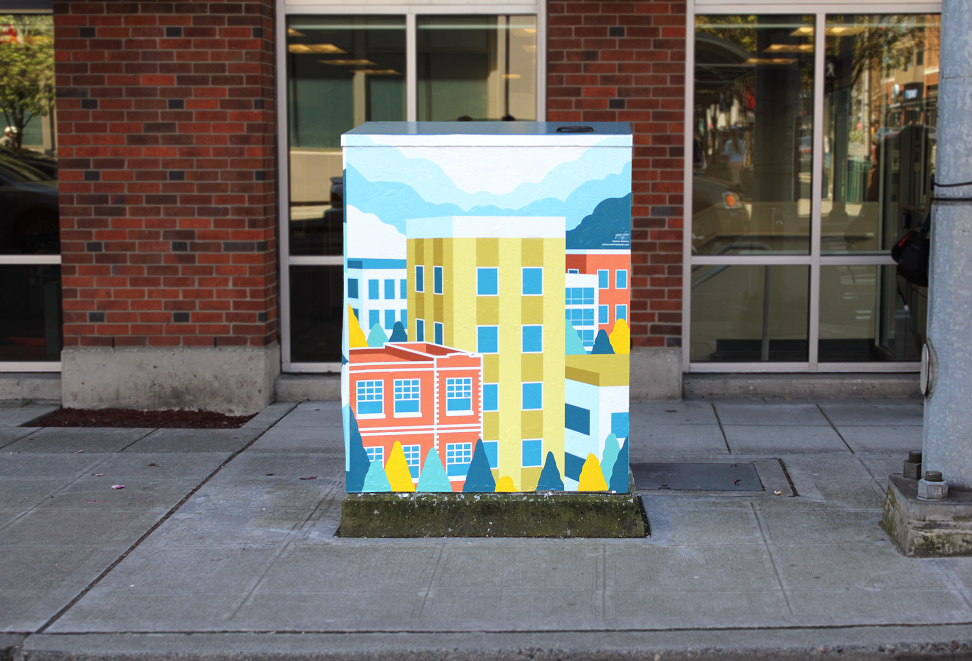
In order to reflect the calmness and peacefulness of First Hill, I decided to compose most of the pieces in a very balanced, often nearly symmetrical fashion, which has the effect of creating a sense of stillness and reliable constance. The technique of using an arch-like framing device was employed in many of the pieces, drawing from European Renaissance-era art in which it was commonly used to unify a composition and create a sense of safe enclosure, which at the time made sense to use so frequently, as the artwork of the time in Europe was often religious or devotional in nature. Only two basic color schemes were used in order to create a sense of variety, while still having obvious relation to each other as a series. The 10 part, 50 panel diagrams I provided received elated acceptance across the board from FHIA, and no revisions were asked to be made. The main compositions are titled Sanctuary I through Sanctuary XX, and can be found all along the map provided on this page. After nearly 6 months of work and around 3 months of waiting for unsuitable winter conditions to subside, the artwork was installed using vinyl wraps, which are made to be UV-resistant, water-resistant, and somewhat graffiti-resistant (although since installation at least one of the boxes has been vandalized), and last on average between 5-7 years, but can last as long as 10 years if conditions are right.
