GATHERING GROUNDS COFFEE & BAKERY
Logo Design
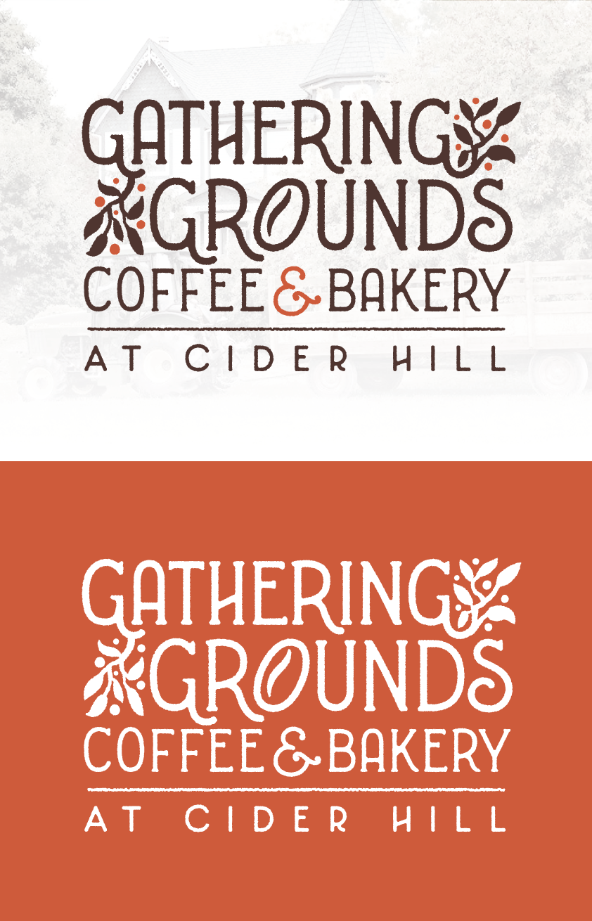
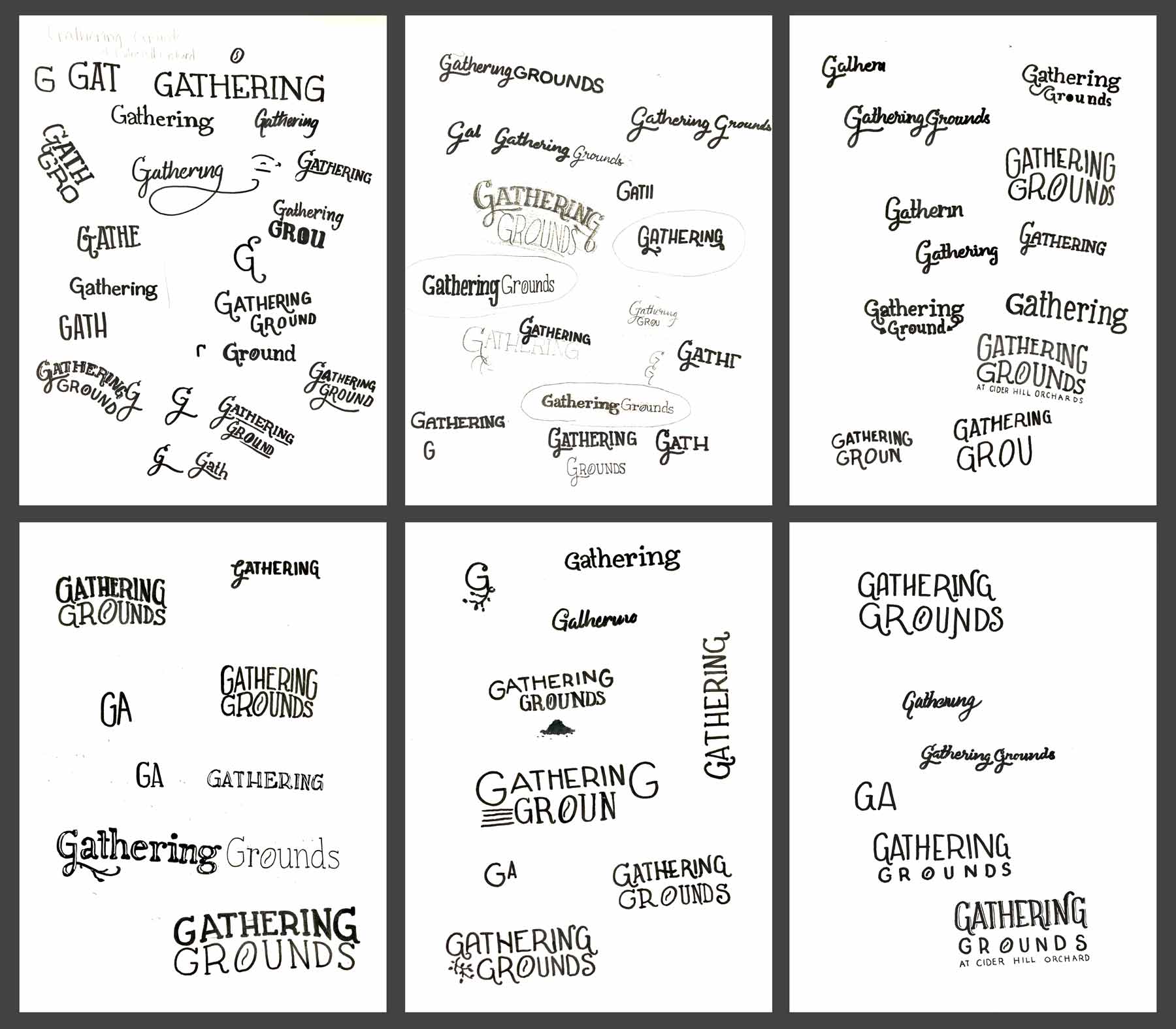
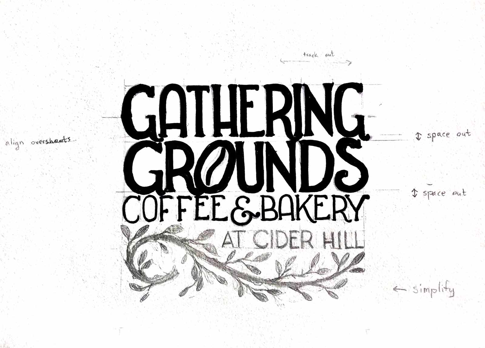
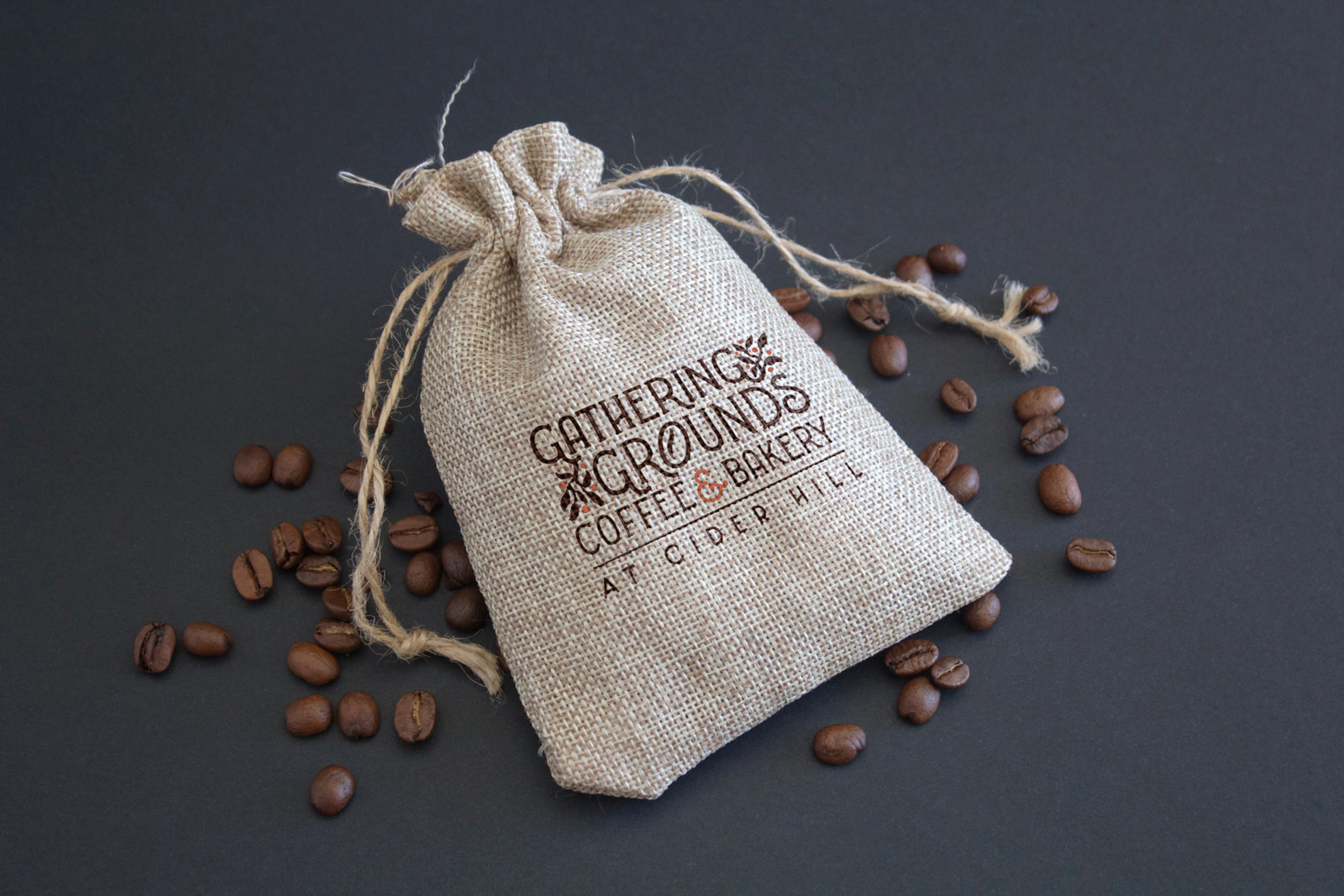
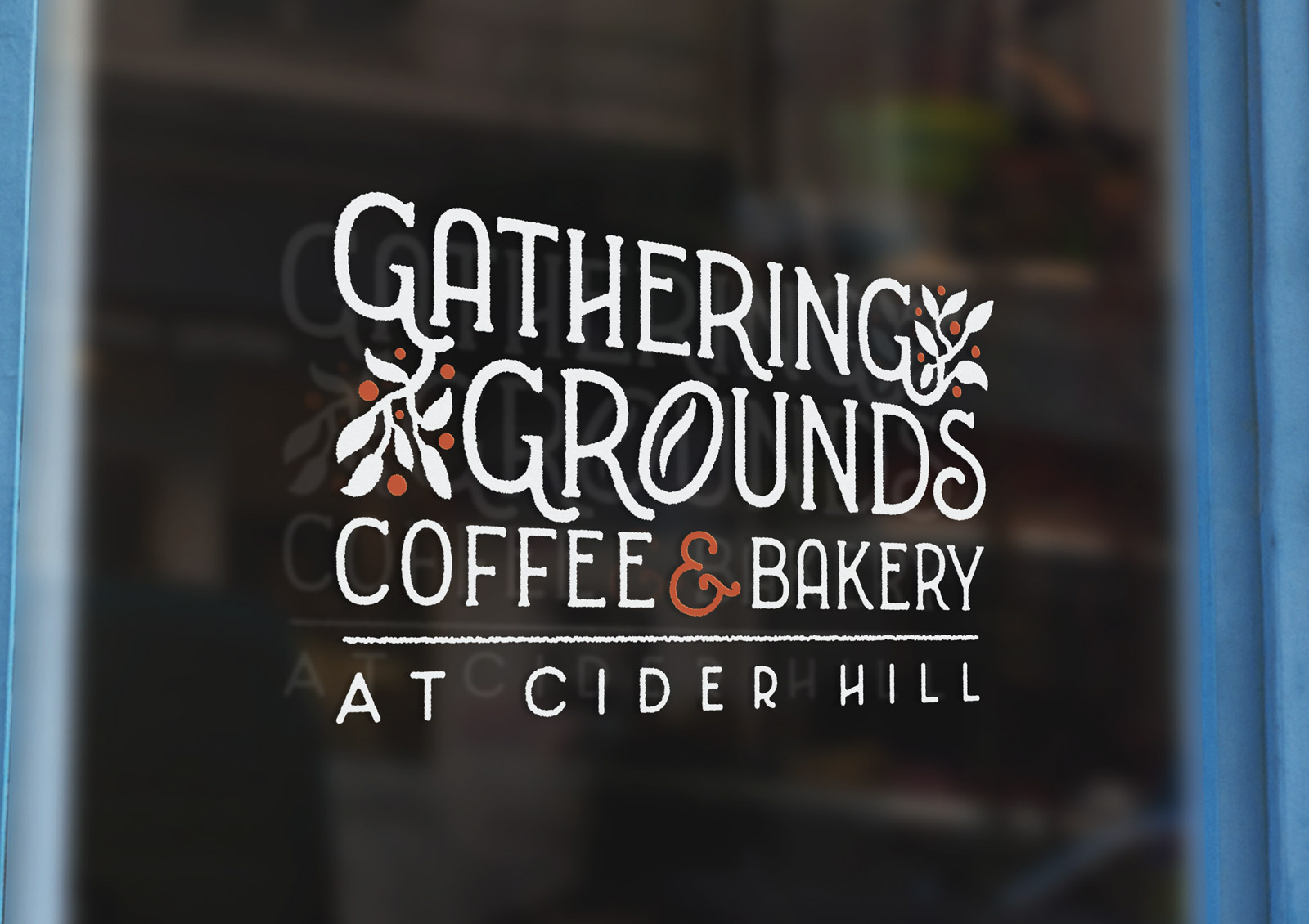
Gathering Grounds Coffee & Bakery at Cider Hill is a Kansas City based coffee shop startup currently still in early development. Because the cafe will be located amidst a scenic, wide open apple orchard, the logo design needed to create feelings of home, friendliness, nature, and a little bit of nostalgia. To meet these requirements, I decided it would be best to go with hand lettering and a rough texture to imbue it with a down to earth, human touch. The client also requested that a coffee bean shape be incorporated into the lettering, so to accomplish this I turned the O in grounds into a minimal coffee bean, so as to not distract from legibility. After experimenting with different ways to design the lettering over several pages of sketchbook, I eventually decided on a style of mildly serifed lettering with large, open counter spaces and high and low crossbar heights, which gives it a more grounded, accessible, and friendly look. This look also mimics early 20th century typography, which adds a touch of nostalgia. The serifs and terminal strokes were then rounded out to soften the look of the letters, as well as to mimic the bleed of ink on paper or burlap coffee bags. Decorative flourishes on the R's and G's were then added, the crossbars of the H's were made diagonal, and the branch element was simplified and better incorporated into the lettering, all of which to incorporate a more dynamic and lightly playful look, again contributing to the logo's friendly, human aspects. Brown was chosen as the main color to allude to the color of coffee grounds and baked goods, while red-orange was chosen as an accent color to allude to the apples found at Cider Hill and the color of coffee cherries. Despite Red-orange was chosen over a more pure red in order to stay closer to the hue of the coffee brown lettering, to make use of the psychology of color in that red-oranges tend to stimulate hunger, and to tone down the aggressiveness of purer reds when used to cover larger spaces, such as the background of an image or various physical surfaces in a coffee shop.
The client and her partners loved the logo and asked for no revisions, however it will be some time until the visual brand is extended past this stage due to the necessary precedence of sorting out the logistics and early stage planning of their business.
