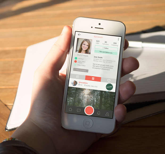
MOJU APP REDESIGN PROPOSAL
UX/UI Design
Notable for being featured in Forbes, TechCrunch, TheNextWeb, various popular blogs, and on the app store, Moju is a Instagram-like mobile app that aims to "put moments into motion" by allowing users to "play" pictures by twisting the phone back and forth, much like a hologram. Moju videos (or "Mojus") are 24 frames long and play back and forth depending on the angle, speed, and direction of the twisting motion.
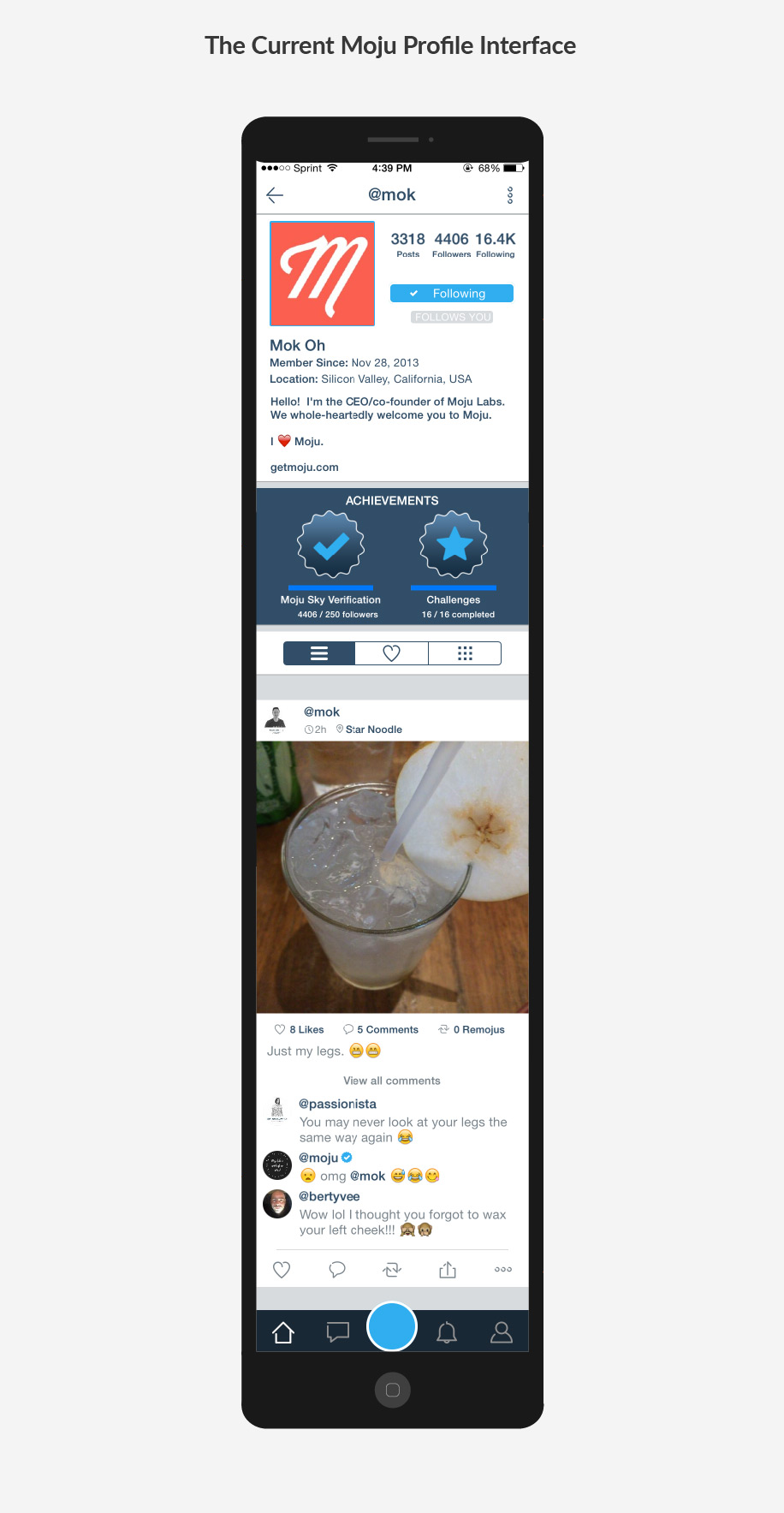
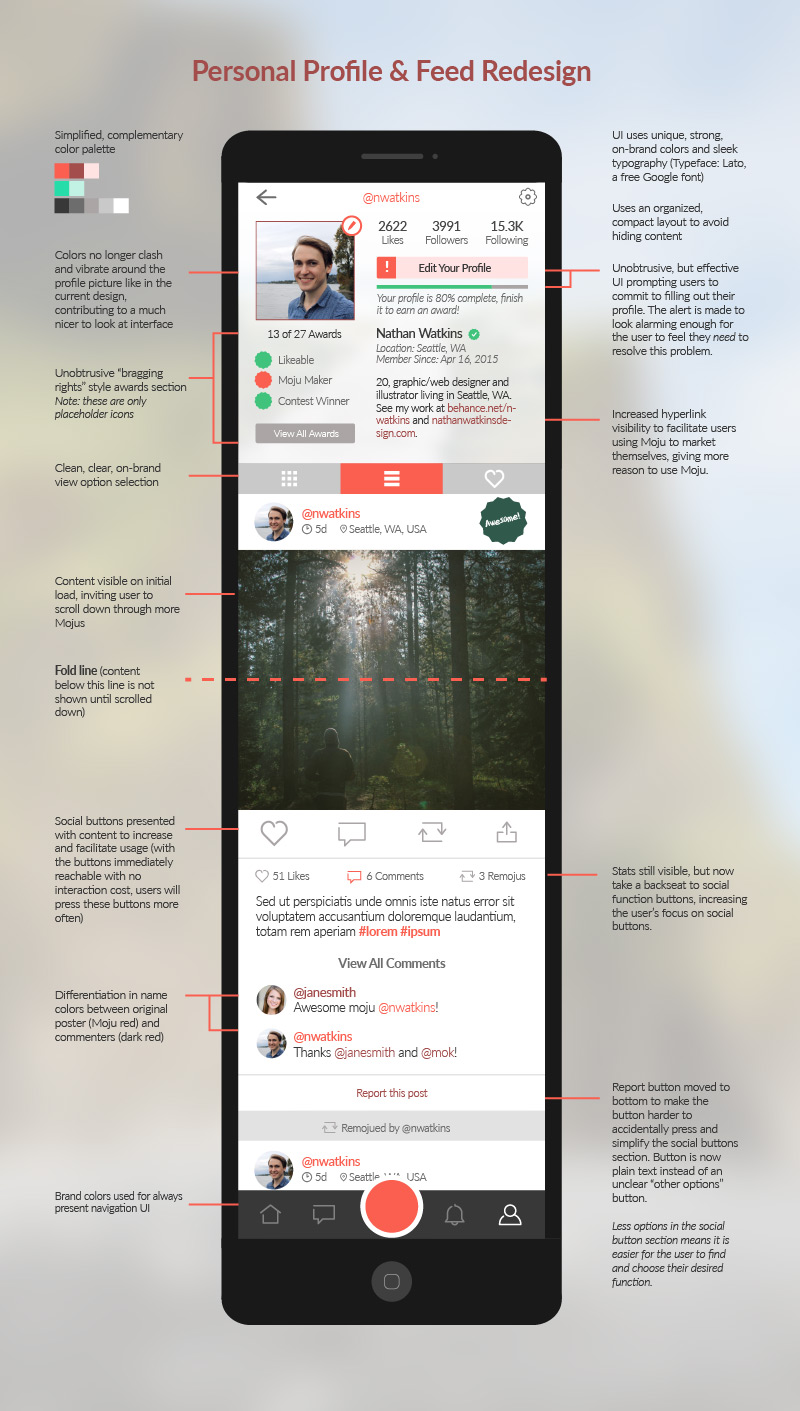
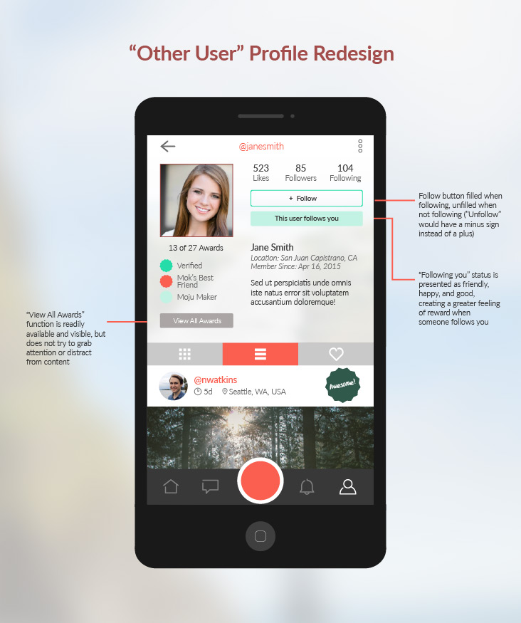
In one of their updates, the Moju Labs team decided to add an achievement based reward system to entice users into committing to app use by rewarding basic usage. Unfortunately, the design had inherent flaws and harmed the user experience by adding a large award showcase section to the top of every user's page, effectively hiding the content that users come to the pages to see. In addition to adding extra interaction costs between the user and their goal, the implementation required an unnecessary amount of both screen. The update weakened Moju's brand identity as well, as it removed the unique red brand color motif from the UI and instead replaced it with shades of blue very closely resembling Instagram and Facebook, companies the app was trying to differentiate itself from. In effect, this hurt Moju's perception as a new brand with a unique idea that makes other social media apps seem boring and out of date, and instead made the app seem more like a buggier, less popular Instagram. This redesign aims to:
- Simplify the interface
- Make the app easier to use
- Create a sleeker, more modern look for the app
- Increase interactions between users and content reach by increasing reblogs ("remojus"), likes, and comments
- Facilitate user commitment to app use
- Strengthen brand identity and improve brand recognition
Unfortunately, due to their lack of resources as a startup, the team was unable to implement all the changes. However, the Moju Labs team was impressed by these ideas and later hired me on to aid in designing Moju's sister app, Mofie.


