SEATTLE CITY LIGHT VEGETATION MANAGEMENT TIPS
Illustration
Overview
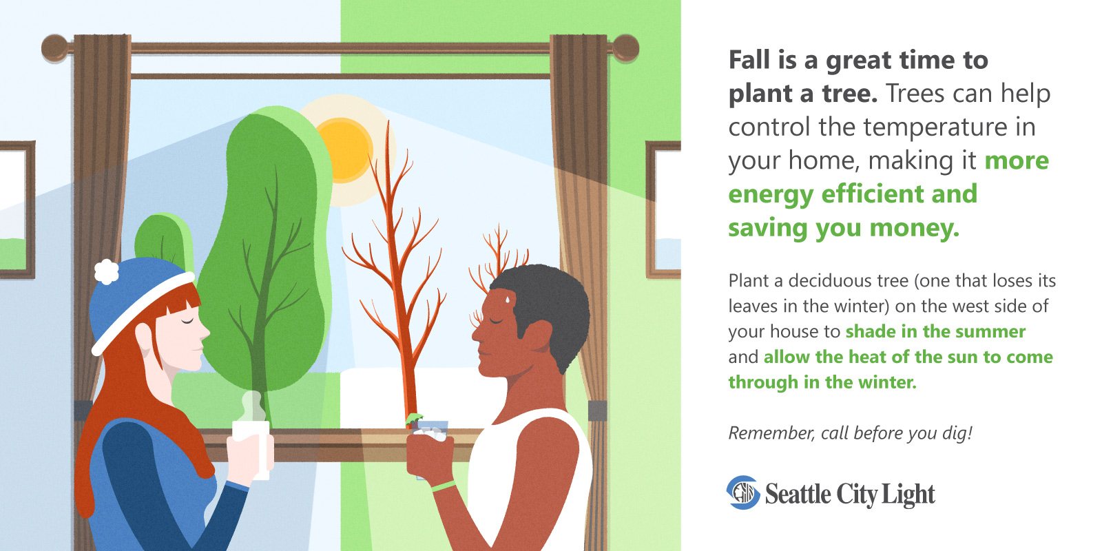
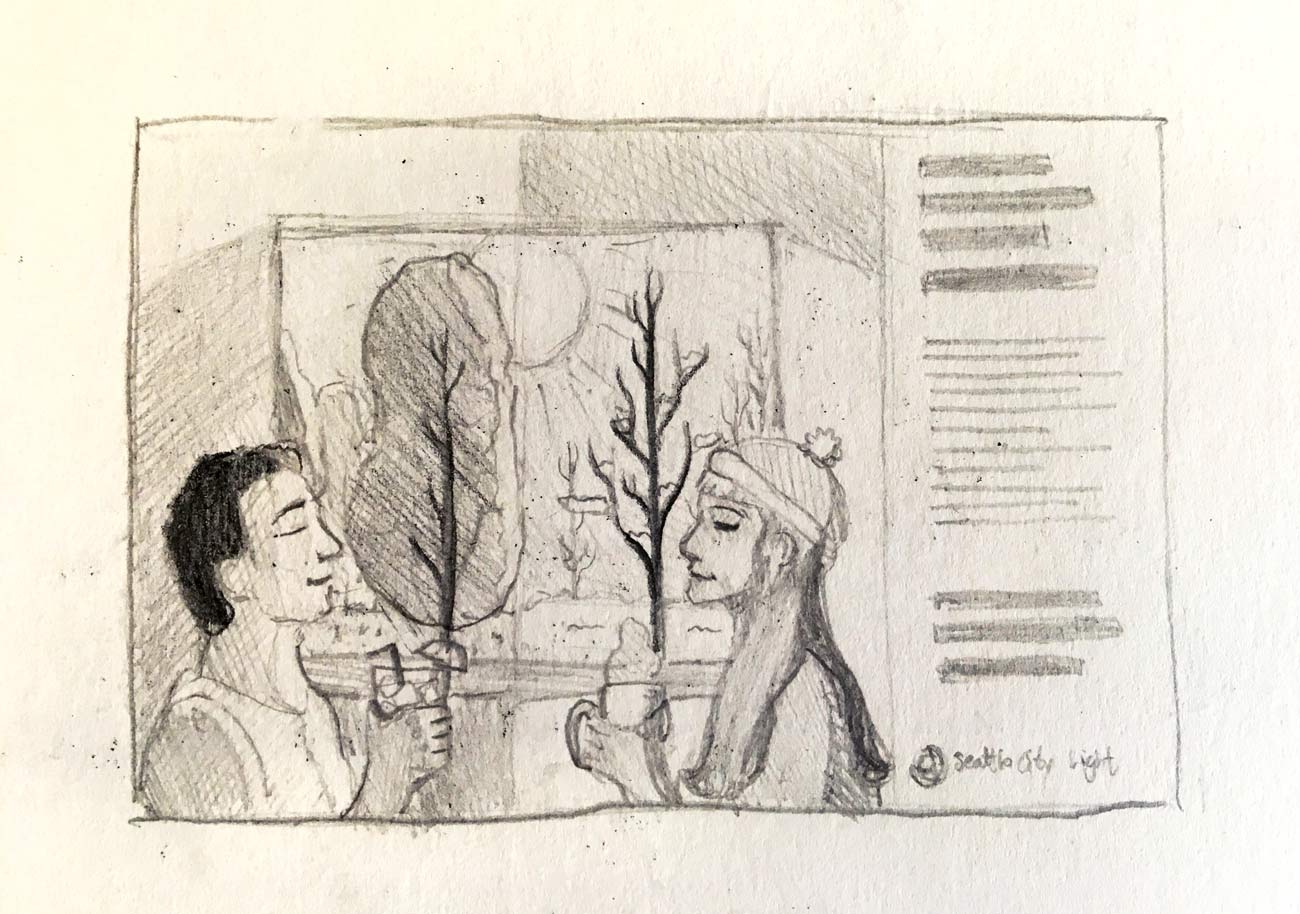
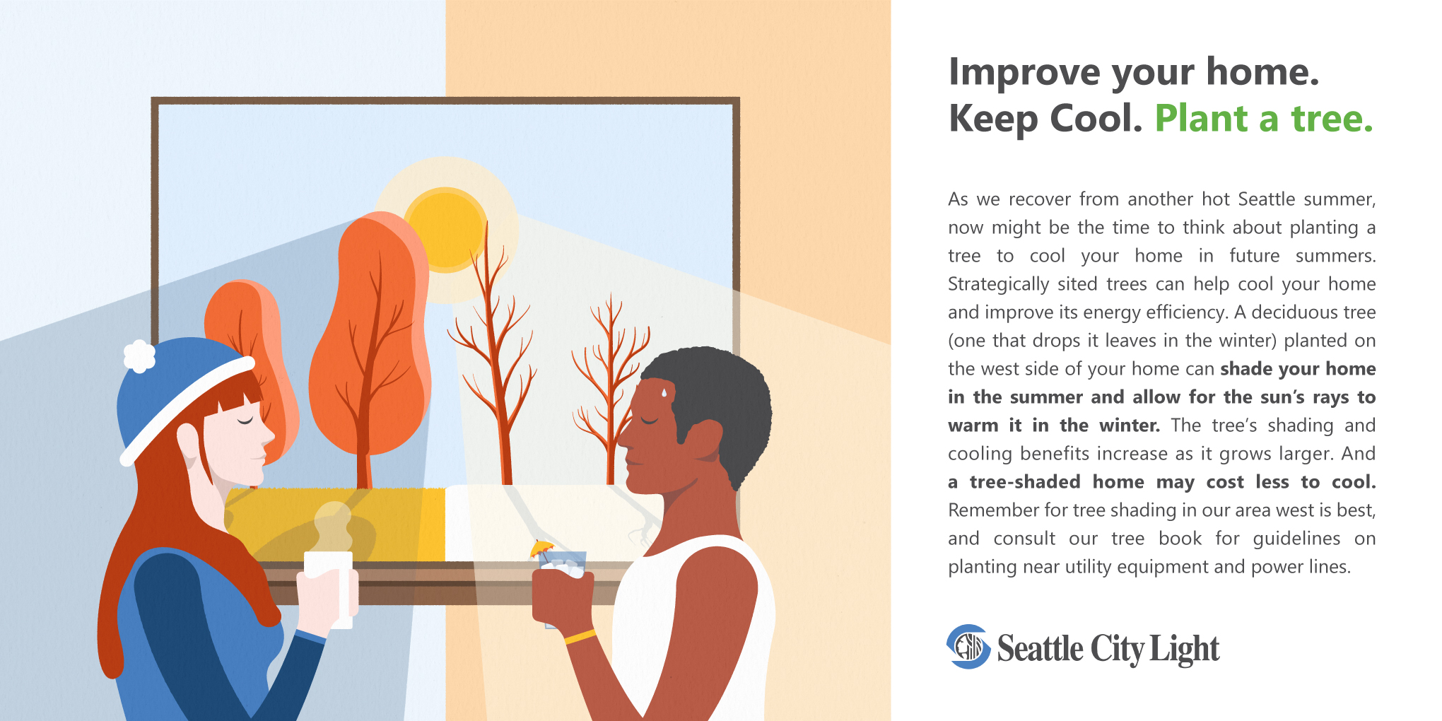
I was commissioned by Seattle City Light's marketing department to create an illustration to help visually explain a tip from their web based energy efficiency campaign. The illustration needed to convey the idea that if you plant a tree on your property outside a sun-facing window, the leaves will give you shade in the summer and reduce the need for air conditioning, while conversely the lack of leaves in the winter will allow sunlight in to help keep your home warm. While this isn't a complicated idea to understand, this did pose the challenge of needing to come up with a way to visually describe something that transposes two moments of time in one location, while also making clear how the constant in this concept, sunlight, would produce opposite effects during these two points of time. In order to make it as simple and quick as possible to understand, I wanted to avoid illustrating this as two separate illustrations for the brain to process, and instead show it through one single image that would explain all of these factors at once. After sketching out ideas that at first focused on the trees and the sunlight, I eventually decided it would be more effective to make the viewer focus on the effects of the trees and the sunlight, and let the explanation follow once they're more interested. Since contrast and opposites are a major concept in this efficiency tip, I knew it would be vital to emphasize this, doing so through color, brightness, lateral symmetry, and illustrated visual elements. However, it also needed to be unified into one coherent visual, so in order to keep the opposite sides from becoming separated, I joined them through the common elements of the window, the sun, and the lawn. Initially I began with a complementary orange and blue color scheme to reference hot and cold, summer and winter, but the client and I agreed that this looked too close to winter and autumn due to the use of orange. To correct this, I changed the color scheme to a more lively blue and green scheme, and created a similar high contrast through the use of color saturation in the wall and the subjects' clothing. Another unifying element, the curtain rod, was added, and two picture frames were added extending outside of the frame to imply the larger scene of a shared house. Finally, the text was added, and through the use of color and font weight, I emphasized the most important bits of information in order to make them easier to digest at a glance.
The client was elated with the final product, and reported that when the illustration was posted to the Seattle City Light Facebook page, the post resulted in 59% greater reach and 36% more engagements than average for the month of September.


