TOTAL-APPS WEBSITE DESIGN & BUSINESS CARDS
Web & Graphic Design
Overview
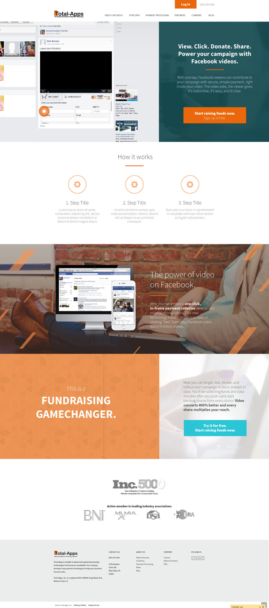
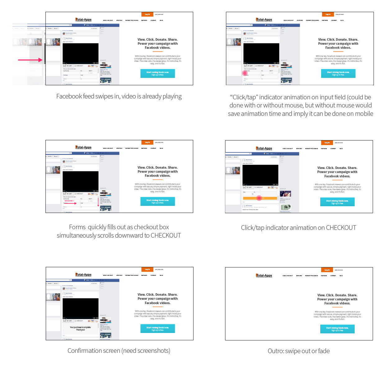
Working with Tim Heitzman for Voxus PR back in 2016, we were tasked with designing a website layout for a tech company that developed a plugin to allow Facebook users to make payments directly from video posts, removing the need for users to ever leave the page and therefore in theory increasing conversion rates and reducing bounce rates. Initially the client wanted a landing page on which the headline and subhead explained everything, but later decided they wanted an autoplay animation in this area, for which I also created a storyboard. Working to refine what it was the client ideally had in mind, the look of the site evolved from a more minimal, white space heavy, light look and feel to a more energetic, colorful look and feel, while still retaining elements of the more minimal design. Eventually, the client decided to remove some of the sections of the landing page in order to make the user flow to the call to action at the bottom of the page more brief. Shown here first is the final design, followed by the development process from initial wireframe to fleshed out design.


