Sunlight Over First Hill I-5 Column Murals
Public Art
Introduction
Shortly after the completion of my 10 signal box art pieces around First Hill, First Hill Improvement Association (FHIA) director Alex Hudson notified me of a new public art project in the works, one that was so significantly large that it necessitated a three stage artist selection process that would be ultimately decided by a public vote. The design would cover 68 pillars under the I-5, stretching three blocks between 7th Ave & James St and 6th Ave & Cherry St. From a massive pool of applicants, FHIA selected five artists to submit design proposals. These design proposals were put online to be voted on by the public, and after a couple weeks the vote closed with astounding results. The column murals were recieved with such widespread appeal and impact that NPR's Seattle-based branch KUOW featured an interview with me in both their 3pm & 5pm Friday airings of All Things Considered and their airing of Morning Edition the following Monday morning.
Public Vote Results
With nearly 3,000 voters having participated, the polls closed with an overwhelmingly decisive winner. My proposal, "Sunlight Over First Hill", won against the four other designers with 40.3% of the vote, or 1,167 of the votes in total.
Concept & Process
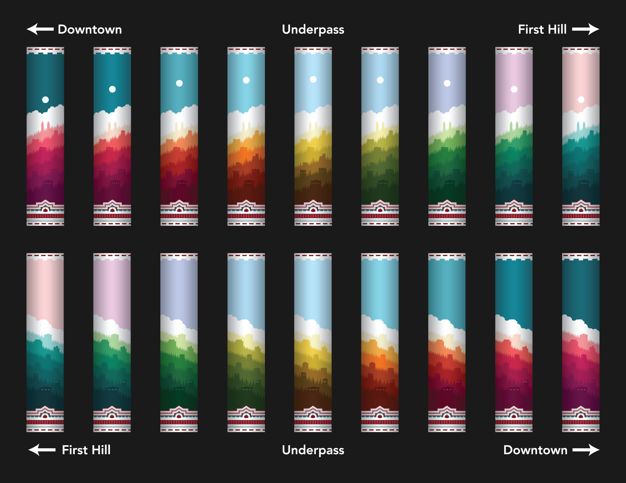
The project was posed to me as a chance to build a "gateway" between Downtown Seattle and First Hill, a word which I focused on throughout the development of the concept. I began thinking about the word "gateway" in terms of a transition, something that needed to be a connecting medium between two starkly different areas of the city. To understand this better, I needed to distinguish what made each area unique. On one side of the pillars lies the always bustling downtown, while on the other side lies the sleepy, always calm First Hill. Every morning the sun rises over First Hill, and hundreds of people wake up to commute downtown to their dayjobs and places of leisure. Every night, the sun sets over Downtown and people return to First Hill to find peace and comfort at home. This transition from calmness to activity, coolness to warmth, and sunrise to sunset would be the overarching concept behind the design.
As for how I would visually execute this idea, I decided the most effective way to signal entry into First Hill to the largest amount of people would be to build from its common visual cues, combining elements taken from Italianate style brick architecture common in First Hill, the steepness of the streets (especially that of the streets on which the pillars lie), identifiable First Hill landmarks, a large amount of urban greenery, and First Hill's geographical bearings.
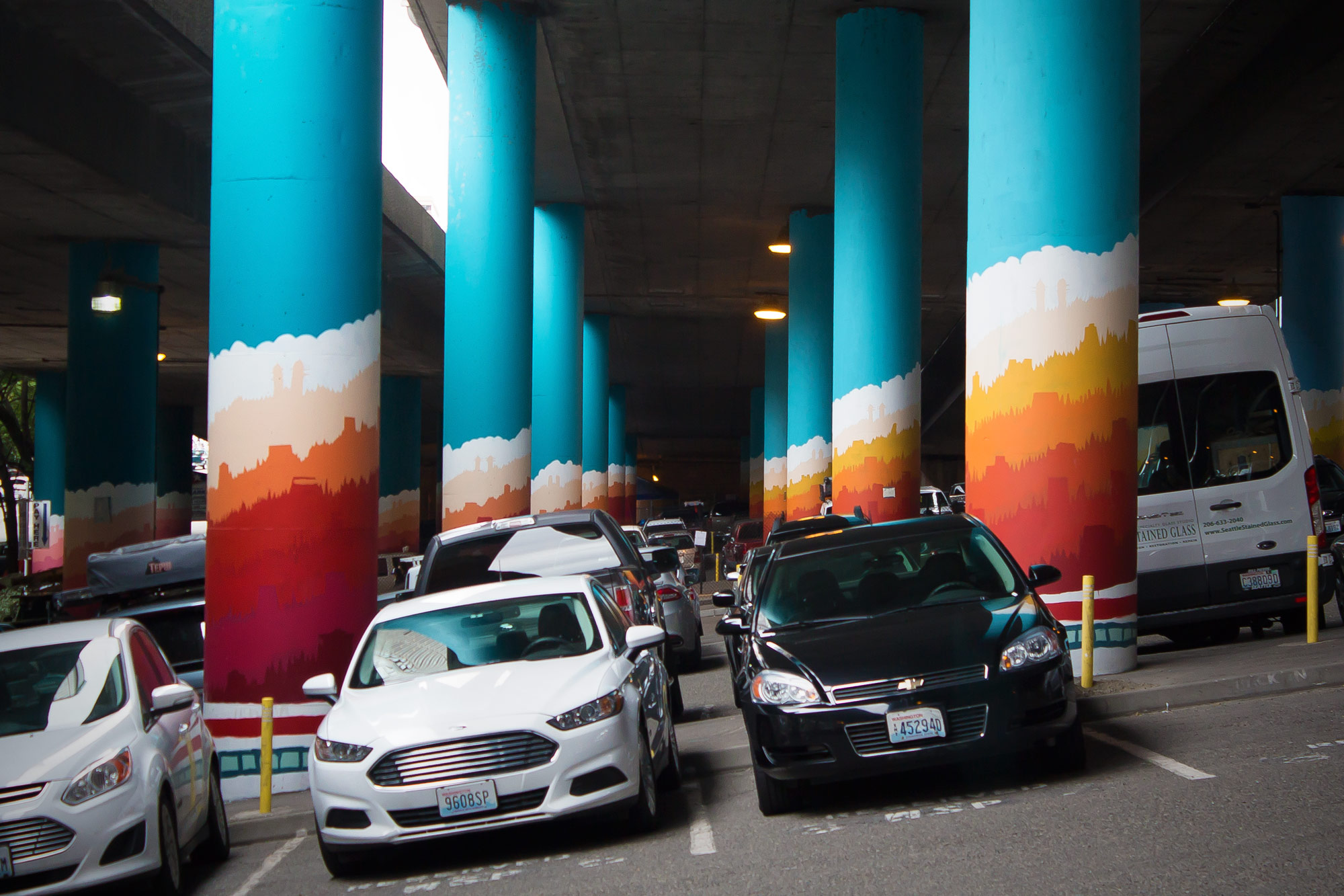
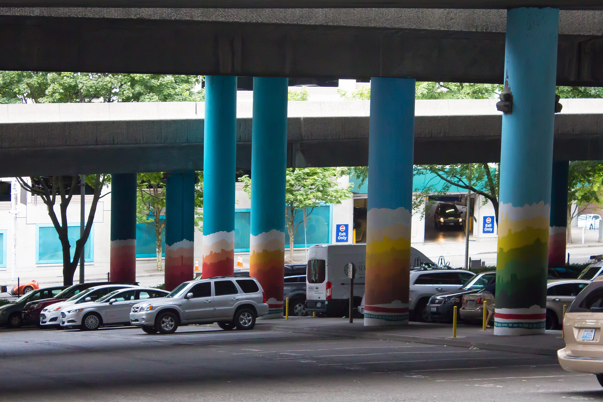
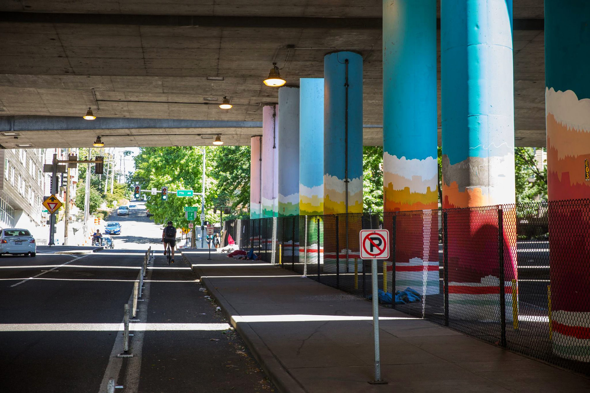
After deciding on a concept, I was then posed with the issue that beautifying these pillars presents: the images could not be distracting, but at the same time they must be eye-catching and beautiful. To address this paradox, I established that the pillar images must contain two coexisting experiences in one: to the drivers, they must be non-focal images, lacking detail or complexity but still creating a beautiful, pleasant, and welcoming visual atmosphere. To the pedestrians, however, they must allow for extended focus and visual exploration, necessitating a higher level of detail and complexity. After moving through countless sketches, I realized the solution to this problem was to design the images in a way in which the larger “coarse” details overpowered the smaller “fine” details, almost as if designing the composition in reverse. With this design, a driver passing these pillars will see an impression of the subject, but from a farther distance and a greater speed the color becomes the focal point and the actual subject matter becomes subdued. A pedestrian, on the other hand, will be nearer and move slow enough to see the detail of the subject matter, which at that distance will demand attention over the overarching swaths of color. Overall, this creates the effect of being eye-catching without actually needing to catch the eye.
Credit
This project was made possible through the hard work of FHIA director Alex Hudson and the FHIA team, as well as the Urban Artworks volunteers for their massive undertaking of painting these pillars. Thanks all!

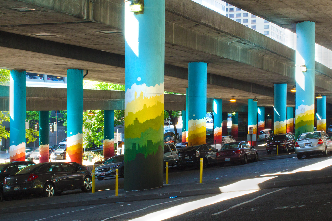
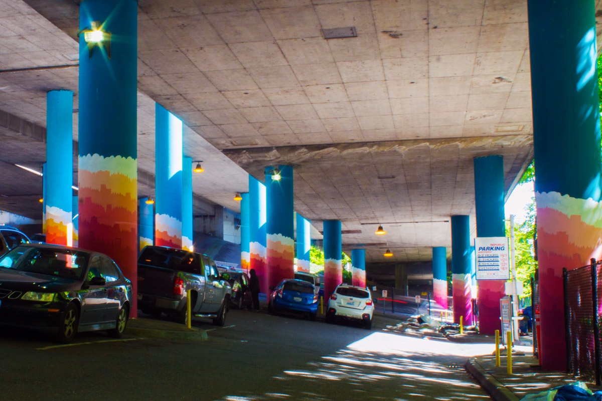


Below: Pictures of the mural still in process. The white bottom sections shown in these were taken out due to difficulty for the painting team to complete them accurately and within budget.

